iOS 7 review with screen shots
Apple has made a major change to iOS, here’s the break down.
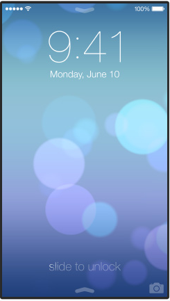
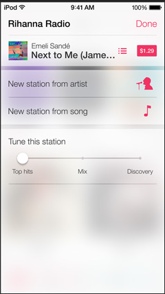
It features a harder to read clock on the lock screen. Apple is using a new line art font, similar to windows phones. Where is the consideration for people with aging vision? Also, why is the slide to unlock so hard to see?

The navigation button above apps is now just text and a less than symbol. It’s not a distinguishable button anymore. People are going to be confused by this. I can guarantee you that my mom will think you can only click on the less than symbol in the corner. “No mom, you don’t have to struggle to click that small thing in the corner, you can click on the word too”.
 The white on white blended theme makes it hard to tell what is part of the app and what is part of the navigation of the app. Not to mention everything is flat and blends together.
![]() The navigation symbols below Safari are hollow line art objects.
The navigation symbols below Safari are hollow line art objects.
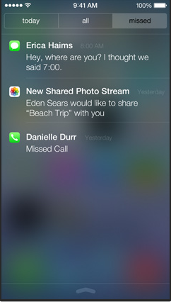 The notification center view is much harder to read due to it being clouded by the semi-transparent background. There are blotches of blurred color all over the screen that skew visiblity. This is very similar to Windows Vista glass.
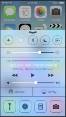 The quick access center is extremely hard to read, it’s laid over a transparency of the main screen background. I guess transparency is the cool thing, but there is nothing in the real world that reflects this. This would be the equivalent of reading a semi transparent newspaper and seeing the TV in the background. I wonder if they think this aids in the readability or clarity of function?
I don’t know how they think this is better design, there are grey blotches all over the screen, and parts of the new color scheme look clownish.
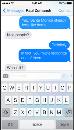
When a text message is sent, the text bubble emerges and rises up from behind the keyboard. This feature obscures the view of the keyboard, and again is visually inconsistent and confusing. Also, there is also no contrast on the keyboard, the keys just blend into the background.
I think the text in the blue bubbles is harder to read.
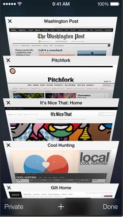 I don’t know what to think of the Safari tab viewing. Before the whole web page could be seen at a glance, now you have to look down at the page from an angle. From this partial view it has to be determined what page is desired. I’m not sure this is a step forward, but I reserve judgement on this.
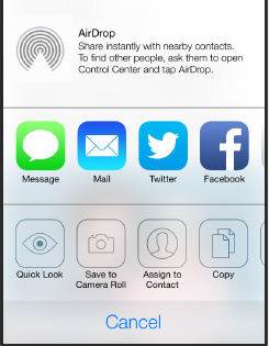
The line art icons for airdrop is just beyond me. How do I tell my dad to tap on something that is barely there. “Yea, dad,, those ghost looking things at the bottom they are icons, you click on them”

The light colors of the Todo list are hard to read against the white background, and it’s difficult to tell where one ends and another begins. This is par for the course for the new flat designs everyone is using. I know everybody is now laughing at the old Skeuomorph type of design, but it was done for a reason. It’s easier for the brain to read and discern object when they are similar to what is in the real world.
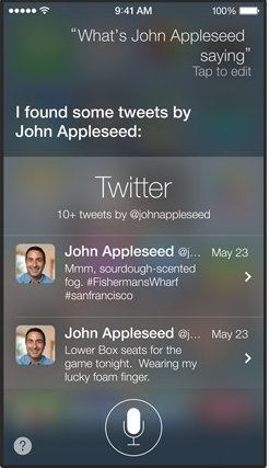
Siri can’t help you, the text is hard to read and blends into a blurry multicolor background.
They say this is simpler, and “simple is not easy”. I don’t think this is simple at all. I think it’s change for the sake of change and fear of people getting bored with iOS. The interface is more visually complex due to blending tones, transparencies, lack of defined buttons, and line art fonts. Now, what is seen has to be evaluated or “figured out” by the brain. The beauty of the original iOS was that you didn’t have to figure out what you were looking at, it was easy to see, read, and relate to. That’s why I loved it.
I think Apple has responded to far too many opinions that iOS needed to be refreshed. I think it was Steve Jobs who said it, but people don’t know what they want.
Update::
Apple has made a lot of small changes to the interface since this review. A lot of these issues are gone. I think some of the fonts are heaver and easier to read now. A setting as also been added to Reduce Motion, and Increase Contrast which eliminates color blending. With the changes I prefer the new design to the older skeuomorphic one.
ios 7 sucks, ios 7 is horrible, ios 7 redesign